Komponenter
DatePicker
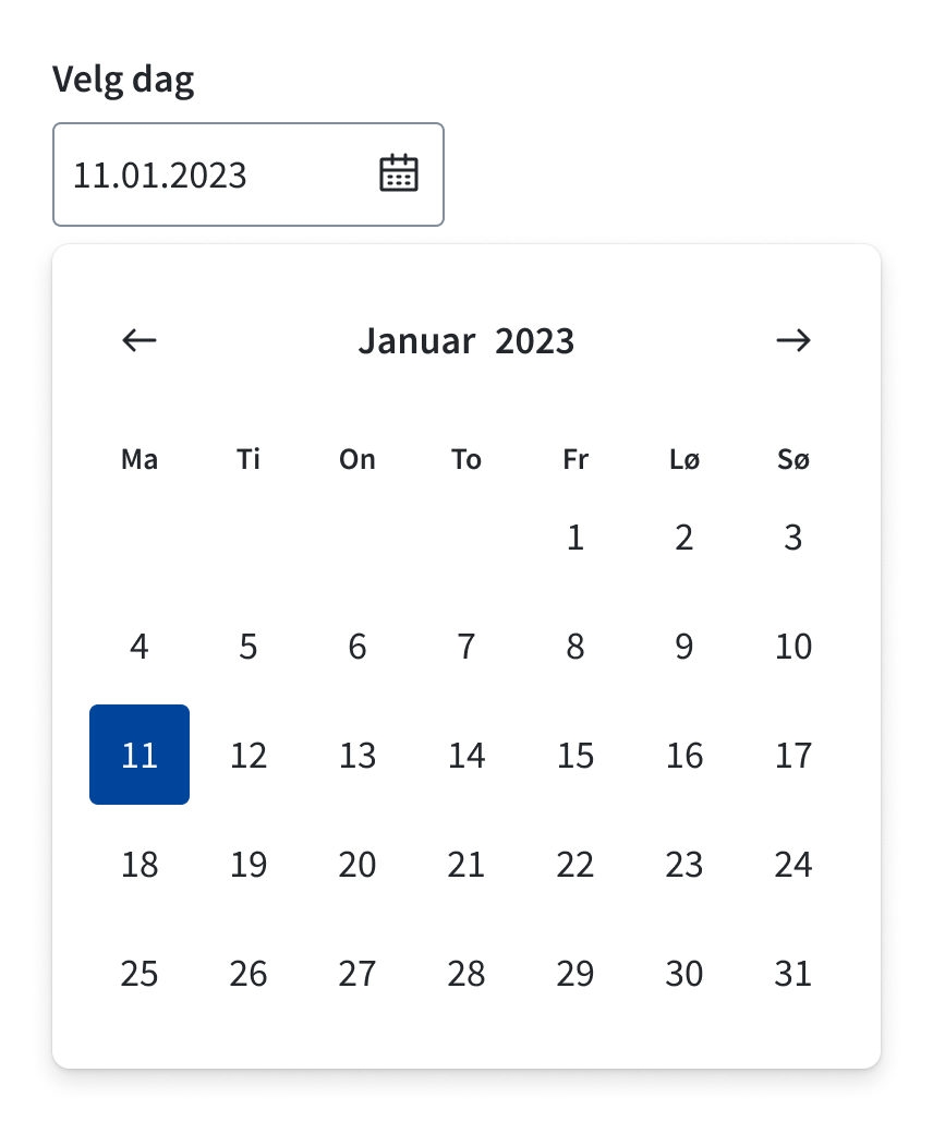
DatePicker lar brukeren velge dager eller perioder. Den kan enten knyttes til et inputfelt eller bygges inn på siden.
Egnet til:
- Velge en eller flere dager.
- Velge en periode.
- Når det er begrensninger i hvilke dager som kan velges.
- Når brukeren trenger hjelp til å finne dato.
Uegnet til:
- Valg av datoer som strekker seg over lengre tid.
- Valg av datoer langt fram eller tilbake i tid.
- Valg av kjente datoer, f.eks. fødselsdato.
Eksempler
Mode
DatePicker kommer med tre forskjellige metoder for å innhente datoer:
- Single: Lar brukeren velge 1 dag.
- Multiple: Lar brukeren velge 1 eller flere dager. Bruk min/max-props for å sette begrensninger her.
- Range: Lar brukeren velge en periode fra-til.
Retningslinjer
Ved valg av datoer langt fram eller tilbake i tid bør man bruke dropdownCaption-prop med fromDate/toDate. Det lar bruker raskere finne fram til den datoen de ønsker.

Vurder om Datepicker er den rette løsningen for deg
Valg av år lengre fram/tilbake i tid må gjøres via en select, noe som er utfordrende når man ender opp med veldig mange valg. Ofte vil det letteste for brukeren være å skrive inn datoen i et TextField. Gov.uk har gjort en del research på valg av dato og velger selv å bare tilby et input uten interaktiv datovelger.
Standard måned
Du kan bruke defaultMonth-propen til å styre hvilken måned som vises når datovelgeren åpnes. Dette er nyttig når du har en antakelse om hvilken måned som er mest aktuell.
Returformat
Komponenten returnerer datoer som et JS Date-objekt. Husk å ta høyde for tidssone ved bruk av f.eks. ISO-format. I selve komponenten bruker vi date-fns v4 for parsing.
Testing
For å få konsekvente datoer lokalt og i testmiljø må du kanskje definere en tidssone i test-rammeverket. For eksempel for Vitest settes miljøvariabelen TZ=UTC.
Tilgjengelighet
Hvis du skal bruke DatePicker med et input, anbefaler vi å bruke DatePicker.Input sammen med useDatepicker- eller useDateRange-hook. Da håndteres fokus og åpning/lukking automatisk.
Props
DatePicker
children?
- Type:ReactNode
- Description:
Element datepicker anchors to. Use <DatePicker.Input /> for built-in toggle, or make your own with the open/onClose props
className?
- Type:string
- Description:
Classname for datepicker in popover
wrapperClassName?
- Type:string
- Description:
Classname for wrapper
translations?
- Type:RecursivePartial<{ chooseDate: string; chooseDates: string; chooseDateRange: string; chooseMonth: string; week: string; weekNumber: string; selectWeekNumber: string; month: string; goToNextMonth: string; ... 7 more ...; closeMonthPicker: string; }>
- Description:
i18n-API for customizing texts and labels.
NB: If you need to change the language, use Provider instead.
fromDate?
- Type:Date
- Description:
The earliest day to start navigation.
toDate?
- Type:Date
- Description:
The latests day to end navigation.
dropdownCaption?
- Type:boolean
- Default:false
- Description:
Display dropdown for choosing the month and the year. Needs
fromDate+toDateto work.
disabled?
- Type:Matcher[]
- Description:
Apply the disabled modifier to the matching days. https://react-day-picker.js.org/api/type-aliases/Matcher
disableWeekends?
- Type:boolean
- Default:false
- Description:
Disable saturday and sunday.
showWeekNumber?
- Type:boolean
- Default:false
- Description:
Shows week numbers in left-column. Use with caution, takes up valuable screenspace for small screens.
fixedWeeks?
- Type:boolean
- Default:false
- Description:
If datepicker should be fixed to 6 weeks, regardless of actual weeks in month.
open?
- Type:boolean
- Description:
Open state for user-controlled state. Component controlled by default.
onClose?
- Type:(() => void)
- Description:
onClose callback for user-controlled state.
onOpenToggle?
- Type:(() => void)
- Description:
onOpenToggle callback for user-controlled state. Only called if
<DatePicker.Input />is used.
strategy?
- Type:"absolute" | "fixed"
- Default:See Popover
- Description:
Avoid using if possible!
Changes what CSS position property to use. You want to use "fixed" if parent wrapper has position relative, but you want popover to escape.
month?
- Type:Date
- Description:
The month displayed in the calendar.
As opposed to
defaultMonth, use this prop withonMonthChangeto change the month programmatically. @see https://daypicker.dev/docs/navigation
onMonthChange?
- Type:MonthChangeEventHandler
- Description:
Event fired when the user navigates between months. @see https://daypicker.dev/docs/navigation#onmonthchange
today?
- Type:Date
- Description:
The today’s date. Default is the current date. This date will get the
todaymodifier to style the day. @see https://daypicker.dev/guides/custom-modifiers#today-modifier
onDayClick?
- Type:DayEventHandler<MouseEvent<Element, MouseEvent>>
- Description:
Event handler when a day is clicked.
defaultMonth?
- Type:Date
- Description:
The initial month to show in the calendar.
Use this prop to let DayPicker control the current month. If you need to set the month programmatically, use {@link month} and {@link onMonthChange}. @defaultValue The current month @see https://daypicker.dev/docs/navigation
mode?
- Type:"multiple" | "single" | "range"
onSelect?
- Type:((val?: Date) => void) | ((val?: Date[]) => void) | ((val?: DateRange | undefined) => void) | undefined
selected?
- Type:Date | Date[] | DateRange
defaultSelected?
- Type:Date | Date[] | DateRange
onWeekNumberClick?
- Type:((week: number, days: Date[]) => void)
- Description:
Allows selecting a week at a time. Only used with
modeis set to "multiple".- week: Current week number
- days: Dates in the week
min?
- Type:number
max?
- Type:number
locale?
- Deprecated:Use `<Provider />`-component
- Type:"nb" | "nn" | "en"
- Default:"nb" (norsk bokmål)
- Description:
Changes datepicker locale
DatePicker.Input
label
- Type:ReactNode
- Description:
Input label
hideLabel?
- Type:boolean
- Default:false
- Description:
Shows label and description for screen readers only
size?
- Type:"medium" | "small"
- Default:"medium"
- Description:
Changes padding and font-sizes
error?
- Type:ReactNode
- Description:
Error message.
errorId?
- Type:string
- Description:
Override internal errorId.
disabled?
- Type:boolean
- Description:
Avoid using if possible for accessibility purposes.
Disables element.
description?
- Type:ReactNode
- Description:
Adds a description to extend the labeling.
id?
- Type:string
- Description:
Override internal id.
readOnly?
- Type:boolean
- Description:
Read-only state.
className?
- Type:string
ref?
- Type:Ref<HTMLInputElement>
- Description:
Allows getting a ref to the component instance. Once the component unmounts, React will set
ref.currenttonull(or call the ref withnullif you passed a callback ref). React Docs
useDatepicker
defaultSelected?
- Type:Date
- Description:
The initially selected Date
defaultMonth?
- Type:Date
- Description:
Default shown month
required?
- Type:boolean
- Description:
Make selection of Date required
onDateChange?
- Type:((val?: Date) => void)
- Description:
Callback for changed state
inputFormat?
- Type:string
- Default:"dd.MM.yyyy"
- Description:
Input-format
onValidate?
- Type:((val: DateValidationT) => void)
- Description:
validation-callback
allowTwoDigitYear?
- Type:boolean
- Default:true
- Description:
Allows input of with
yyyear format.Decision between 20th and 21st century is based on before(todays year - 80) ? 21st : 20th. e.g. In 2024 this equals to 1944 - 2043.
fromDate?
- Type:Date
- Description:
The earliest day to start navigation.
toDate?
- Type:Date
- Description:
The latests day to end navigation.
today?
- Type:Date
- Description:
The today’s date. Default is the current date. This date will get the
todaymodifier to style the day. @see https://daypicker.dev/guides/custom-modifiers#today-modifier
disabled?
- Type:Matcher[]
- Description:
Apply the disabled modifier to the matching days. https://react-day-picker.js.org/api/type-aliases/Matcher
disableWeekends?
- Type:boolean
- Default:false
- Description:
Disable saturday and sunday.
locale?
- Deprecated:Use `<Provider />`-component
- Type:"nb" | "nn" | "en"
- Default:"nb" (norsk bokmål)
- Description:
Changes datepicker locale
useRangeDatepicker
defaultSelected?
- Type:DateRange
- Description:
The initially selected DateRange
onRangeChange?
- Type:((val?: DateRange) => void)
- Description:
Callback for changed state
onValidate?
- Type:((val: RangeValidationT) => void)
- Description:
validation-callback
fromDate?
- Type:Date
- Description:
The earliest day to start navigation.
toDate?
- Type:Date
- Description:
The latests day to end navigation.
today?
- Type:Date
- Description:
The today’s date. Default is the current date. This date will get the
todaymodifier to style the day. @see https://daypicker.dev/guides/custom-modifiers#today-modifier
disabled?
- Type:Matcher[]
- Description:
Apply the disabled modifier to the matching days. https://react-day-picker.js.org/api/type-aliases/Matcher
disableWeekends?
- Type:boolean
- Default:false
- Description:
Disable saturday and sunday.
defaultMonth?
- Type:Date
- Description:
Default shown month
required?
- Type:boolean
- Description:
Make selection of Date required
inputFormat?
- Type:string
- Default:"dd.MM.yyyy"
- Description:
Input-format
allowTwoDigitYear?
- Type:boolean
- Default:true
- Description:
Allows input of with
yyyear format.Decision between 20th and 21st century is based on before(todays year - 80) ? 21st : 20th. e.g. In 2024 this equals to 1944 - 2043.
locale?
- Deprecated:Use `<Provider />`-component
- Type:"nb" | "nn" | "en"
- Default:"nb" (norsk bokmål)
- Description:
Changes datepicker locale
DatePicker.Standalone
className?
- Type:string
- Description:
Datepicker classname
children?
- Type:ReactNode
- Description:
Element datepicker anchors to. Use <DatePicker.Input /> for built-in toggle, or make your own with the open/onClose props
month?
- Type:Date
- Description:
The month displayed in the calendar.
As opposed to
defaultMonth, use this prop withonMonthChangeto change the month programmatically. @see https://daypicker.dev/docs/navigation
onMonthChange?
- Type:MonthChangeEventHandler
- Description:
Event fired when the user navigates between months. @see https://daypicker.dev/docs/navigation#onmonthchange
today?
- Type:Date
- Description:
The today’s date. Default is the current date. This date will get the
todaymodifier to style the day. @see https://daypicker.dev/guides/custom-modifiers#today-modifier
onDayClick?
- Type:DayEventHandler<MouseEvent<Element, MouseEvent>>
- Description:
Event handler when a day is clicked.
defaultMonth?
- Type:Date
- Description:
The initial month to show in the calendar.
Use this prop to let DayPicker control the current month. If you need to set the month programmatically, use {@link month} and {@link onMonthChange}. @defaultValue The current month @see https://daypicker.dev/docs/navigation
translations?
- Type:RecursivePartial<{ chooseDate: string; chooseDates: string; chooseDateRange: string; chooseMonth: string; week: string; weekNumber: string; selectWeekNumber: string; month: string; goToNextMonth: string; ... 7 more ...; closeMonthPicker: string; }>
- Description:
i18n-API for customizing texts and labels.
NB: If you need to change the language, use Provider instead.
fromDate?
- Type:Date
- Description:
The earliest day to start navigation.
toDate?
- Type:Date
- Description:
The latests day to end navigation.
dropdownCaption?
- Type:boolean
- Default:false
- Description:
Display dropdown for choosing the month and the year. Needs
fromDate+toDateto work.
disabled?
- Type:Matcher[]
- Description:
Apply the disabled modifier to the matching days. https://react-day-picker.js.org/api/type-aliases/Matcher
disableWeekends?
- Type:boolean
- Default:false
- Description:
Disable saturday and sunday.
showWeekNumber?
- Type:boolean
- Default:false
- Description:
Shows week numbers in left-column. Use with caution, takes up valuable screenspace for small screens.
fixedWeeks?
- Type:boolean
- Default:false
- Description:
If datepicker should be fixed to 6 weeks, regardless of actual weeks in month.
mode?
- Type:"single" | "multiple" | "range"
onSelect?
- Type:((val?: Date) => void) | ((val?: Date[]) => void) | ((val?: DateRange | undefined) => void) | undefined
selected?
- Type:Date | Date[] | DateRange
defaultSelected?
- Type:Date | Date[] | DateRange
onWeekNumberClick?
- Type:((week: number, days: Date[]) => void)
- Description:
Allows selecting a week at a time. Only used with
modeis set to "multiple".- week: Current week number
- days: Dates in the week
ref?
- Type:Ref<HTMLDivElement>
- Description:
Allows getting a ref to the component instance. Once the component unmounts, React will set
ref.currenttonull(or call the ref withnullif you passed a callback ref). React Docs
min?
- Type:number
max?
- Type:number
locale?
- Deprecated:Use `<Provider />`-component
- Type:"nb" | "nn" | "en"
- Default:"nb" (norsk bokmål)
- Description:
Changes datepicker locale