Komponenter
MonthPicker
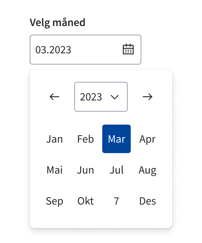
MonthPicker lar brukeren velge en måned. Den kan enten knyttes til et inputfelt eller bygges inn på siden.
Egnet til:
- Velge en spesifikk måned
Eksempler
Retningslinjer
Datoer langt bak eller frem i tid
Ved valg av datoer som er langt bak eller frem i tid, bør man bruke dropdownCaption-prop med fromDate/toDate. Det lar brukeren raskere finne fram til riktig år.
Returformat
Komponenten returnerer datoer som et JS Date-objekt. Husk å ta høyde for tidssone ved bruk av f.eks. ISO-format. I selve komponenten bruker vi date-fns v4 for parsing.
Standard år
Du kan bruke defaultYear-propen til å styre hvilket år som vises når månedsvelgeren åpnes. Dette er nyttig når du har en antakelse om hvilket år som er mest aktuelt.
Testing
For å få konsekvente datoer lokalt og i testmiljø må du kanskje definere en tidssone i test-rammeverket. For eksempel for Vitest settes miljøvariabelen TZ=UTC.
Tilgjengelighet
Hvis du skal bruke DatePicker med et input, anbefaler vi å bruke MonthPicker.Input sammen med useMonthpicker-hooken. Da håndteres fokus og åpning/lukking automatisk.
Props
MonthPicker
children?
- Type:ReactNode
- Description:
Element monthpicker anchors to. Use <MonthPicker.Input /> for built-in toggle, or make your own with the open/onClose props
className?
- Type:string
- Description:
Classname for datepicker in popover
wrapperClassName?
- Type:string
- Description:
Classname for wrapper
fromDate?
- Type:Date
- Description:
The earliest month to start navigation.
toDate?
- Type:Date
- Description:
The latest day to end navigation.
translations?
- Type:RecursivePartial<{ chooseDate: string; chooseDates: string; chooseDateRange: string; chooseMonth: string; week: string; weekNumber: string; selectWeekNumber: string; month: string; goToNextMonth: string; ... 7 more ...; closeMonthPicker: string; }>
- Description:
i18n-API for customizing texts and labels.
NB: If you need to change the language, use Provider instead.
dropdownCaption?
- Type:boolean
- Default:false
- Description:
Display dropdown for choosing year. Needs
fromDate+toDateto work.
disabled?
- Type:Matcher[]
- Description:
Apply the disabled modifier to the matching months. Uses a subset of React Day Picker Matcher type. https://react-day-picker.js.org/api/type-aliases/Matcher
selected?
- Type:Date
- Description:
Controlled selected-month
defaultSelected?
- Type:Date
- Description:
Default selected month.
open?
- Type:boolean
- Description:
Open state for user-controlled state. Component controlled by default
onClose?
- Type:(() => void)
- Description:
onClose callback for user-controlled state
onOpenToggle?
- Type:(() => void)
- Description:
onOpenToggle callback for user-controlled-state. Only called if
<MonthPicker.Input />is used
onMonthSelect?
- Type:((month?: Date) => void)
- Description:
Callback for user-controlled state
year?
- Type:Date
- Description:
Used to set visible year programmatically. Component controlled by default
onYearChange?
- Type:((y?: Date) => void)
- Description:
Event fired when the user navigates between years.
strategy?
- Type:"fixed" | "absolute"
- Default:"absolute"
- Description:
Avoid using if possible!
Changes what CSS position property to use You want to use "fixed" if parent wrapper has position relative, but you want popover to escape
locale?
- Deprecated:Use `<Provider />`-component
- Type:"nb" | "nn" | "en"
- Default:"nb" (norsk bokmål)
- Description:
Changes monthpicker locale
MonthPicker.Input
label
- Type:ReactNode
- Description:
Input label
hideLabel?
- Type:boolean
- Default:false
- Description:
Shows label and description for screen readers only
size?
- Type:"medium" | "small"
- Default:"medium"
- Description:
Changes padding and font-sizes
error?
- Type:ReactNode
- Description:
Error message.
errorId?
- Type:string
- Description:
Override internal errorId.
disabled?
- Type:boolean
- Description:
Avoid using if possible for accessibility purposes.
Disables element.
description?
- Type:ReactNode
- Description:
Adds a description to extend the labeling.
id?
- Type:string
- Description:
Override internal id.
readOnly?
- Type:boolean
- Description:
Read-only state.
className?
- Type:string
ref?
- Type:Ref<HTMLInputElement>
- Description:
Allows getting a ref to the component instance. Once the component unmounts, React will set
ref.currenttonull(or call the ref withnullif you passed a callback ref). React Docs
useMonthpicker
required?
- Type:boolean
- Description:
Make Date-selection required
onMonthChange?
- Type:((date?: Date) => void)
- Description:
Callback for month-change
inputFormat?
- Type:string
- Default:"MMMM yyyy"
- Description:
Input-format
onValidate?
- Type:((val: MonthValidationT) => void)
- Description:
validation-callback
defaultYear?
- Type:Date
- Description:
Default shown year
allowTwoDigitYear?
- Type:boolean
- Default:true
- Description:
Allows input of with
yyyear format.Decision between 20th and 21st century is based on before(todays year - 80) ? 21st : 20th. In 2024 this equals to 1944 - 2043
fromDate?
- Type:Date
- Description:
The earliest month to start navigation.
toDate?
- Type:Date
- Description:
The latest day to end navigation.
disabled?
- Type:Matcher[]
- Description:
Apply the disabled modifier to the matching months. Uses a subset of React Day Picker Matcher type. https://react-day-picker.js.org/api/type-aliases/Matcher
defaultSelected?
- Type:Date
- Description:
Default selected month.
locale?
- Deprecated:Use `<Provider />`-component
- Type:"nb" | "nn" | "en"
- Default:"nb" (norsk bokmål)
- Description:
Changes monthpicker locale
MonthPicker.Standalone
className?
- Type:string
- Description:
Monthpicker classname
children?
- Type:ReactNode
- Description:
Element monthpicker anchors to. Use <MonthPicker.Input /> for built-in toggle, or make your own with the open/onClose props
fromDate?
- Type:Date
- Description:
The earliest month to start navigation.
toDate?
- Type:Date
- Description:
The latest day to end navigation.
translations?
- Type:RecursivePartial<{ chooseDate: string; chooseDates: string; chooseDateRange: string; chooseMonth: string; week: string; weekNumber: string; selectWeekNumber: string; month: string; goToNextMonth: string; ... 7 more ...; closeMonthPicker: string; }>
- Description:
i18n-API for customizing texts and labels.
NB: If you need to change the language, use Provider instead.
dropdownCaption?
- Type:boolean
- Default:false
- Description:
Display dropdown for choosing year. Needs
fromDate+toDateto work.
disabled?
- Type:Matcher[]
- Default:[]
- Description:
Apply the disabled modifier to the matching months. Uses a subset of React Day Picker Matcher type. https://react-day-picker.js.org/api/type-aliases/Matcher
selected?
- Type:Date
- Description:
Controlled selected-month
defaultSelected?
- Type:Date
- Description:
Default selected month.
onMonthSelect?
- Type:((month?: Date) => void)
- Description:
Callback for user-controlled state
year?
- Type:Date
- Description:
Used to set visible year programmatically. Component controlled by default
onYearChange?
- Type:((y?: Date) => void)
- Description:
Event fired when the user navigates between years.
ref?
- Type:Ref<HTMLDivElement>
- Description:
Allows getting a ref to the component instance. Once the component unmounts, React will set
ref.currenttonull(or call the ref withnullif you passed a callback ref). React Docs
locale?
- Deprecated:Use `<Provider />`-component
- Type:"nb" | "nn" | "en"
- Default:"nb" (norsk bokmål)
- Description:
Changes monthpicker locale